Depending on where you live and your own local climatic conditions, you are either experiencing the end of summer or the very first days of fall. Of course, we cannot get our homes ready for fall festivities once the season is well and truly here. The preparations, much like in the case of a switch in the wardrobe need to start early and that is exactly the advantage we wish to give our by showcasing the hottest decorating trends of fall 2020 for various rooms of your house as early as possible. Today, we move away from the usual lineup of bedrooms, kitchens and living spaces as we take a look at perfect hues that usher fall goodness into the nursery.


Fall nursery trends are much more than seasonal hues that need to be shifted out once you start experiencing the chill of winter. In fact, these colors create a ‘fall inspired’ setting in the nursery no matter what the season is outside. If you love the changing hues of reddish-orange leaves, beautiful sunsets and autumn violets, then you will adore these gorgeous nurseries and the restrained beauty that they exude. Step into the captivating world of nurseries draped in fall colors –
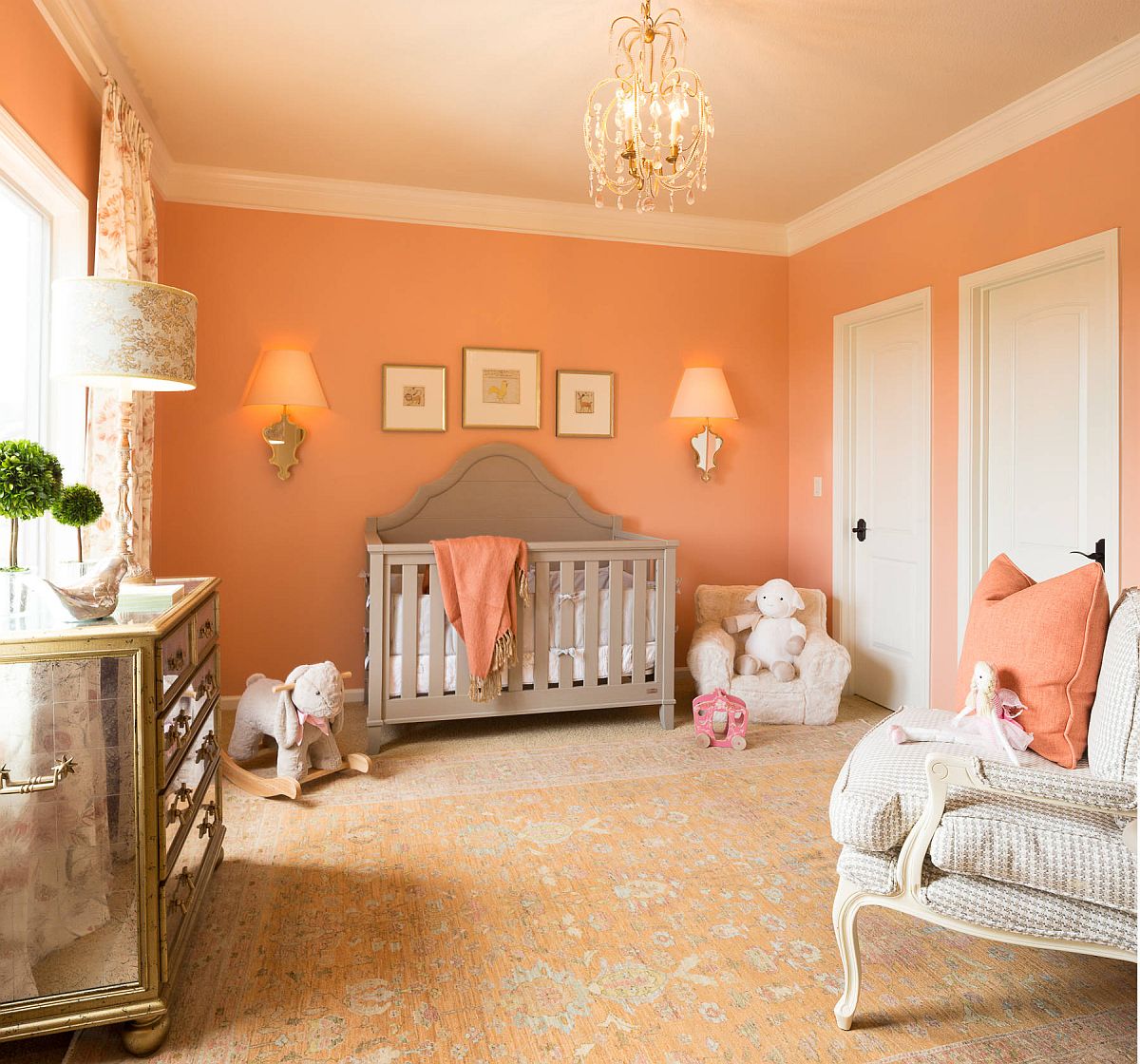
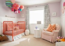
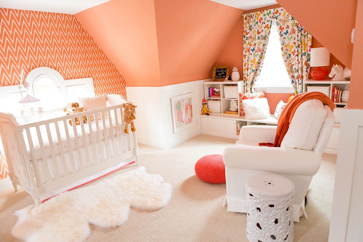
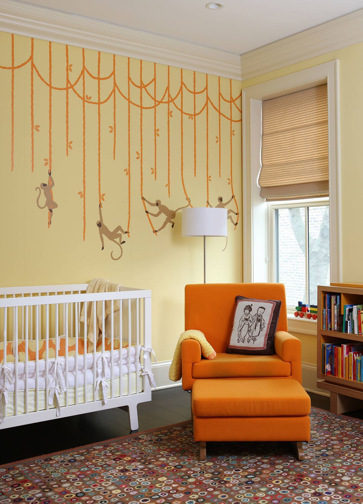
That Perfect Orange
Too much of bright orange in the nursery is never a good idea and one that we would definitely not recommend. Bright colors with glossy finish tend to keep your kids up longer and while you always need some color in the nursery, an overdose of orange is definitely not recommended. But you can use the color in its more matte form and shades like cantaloupe, papaya whip and melon to ensure that the backdrop is not too glaring. Mellow orange shades coupled with bright yellow and orange accents thrown into the mix perfectly epitomize the ‘natural colors’ of fall at their beautiful best.
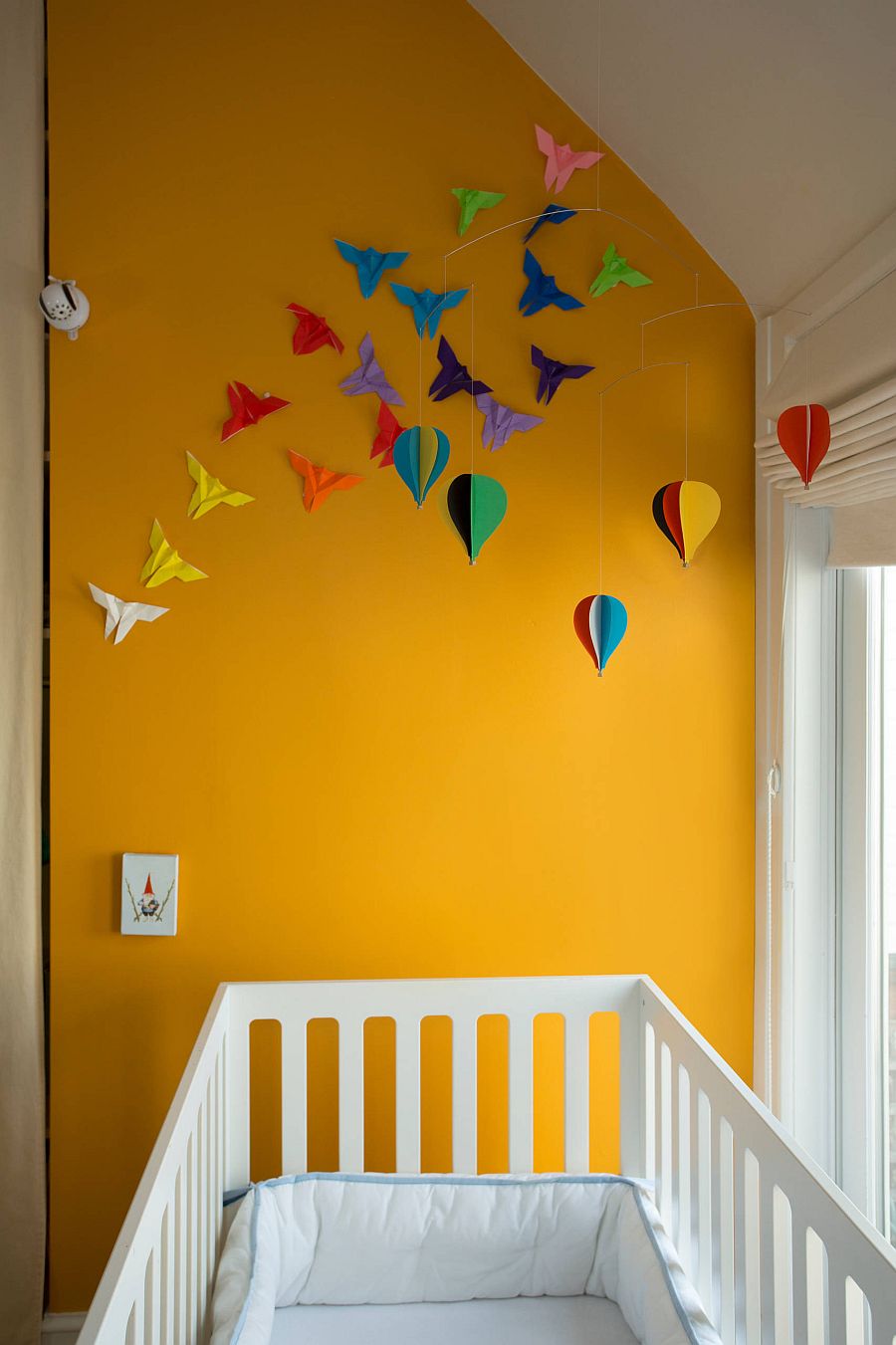
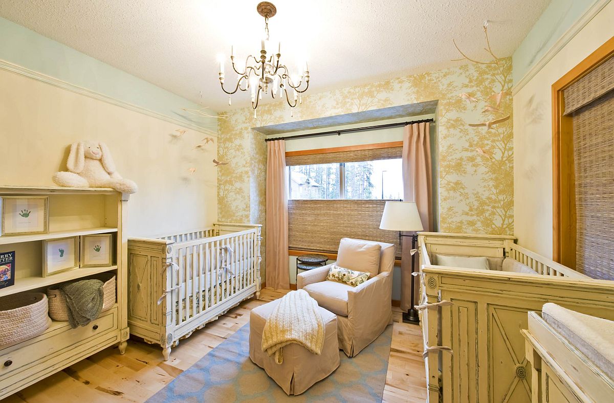
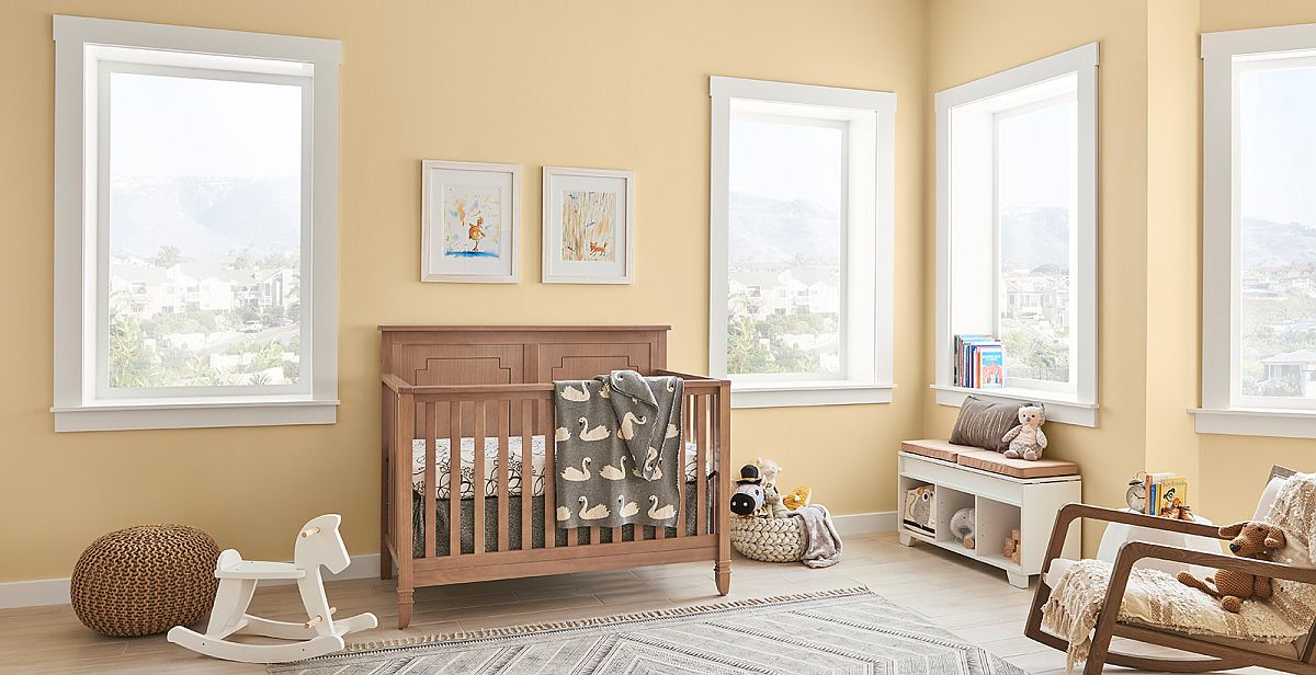
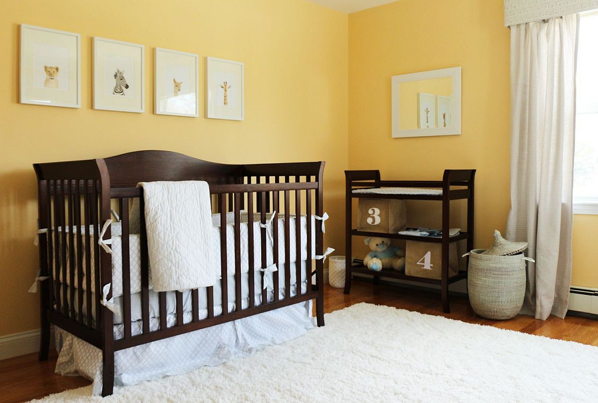
Yellow with a Mellow Twist
Much like orange, bright and glossy yellow hades usually are reserved for nurseries with a more ‘summer’ vibe. With the fall theme you would want lighter, mellow yellows to shape the background in the room and combining orange with yellow in here is a smart idea. If you want to usher in just yellow accents into a white modern nursery, then there is a larger scope to using brighter shades of the color. Dark beige, light lemon yellow, mellow butter and many more – there are plenty of lovely yellow shades that you can try out in the nursery and create styles that range from contemporary to Mediterranean.
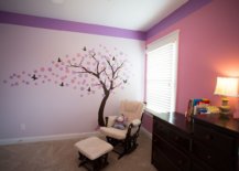
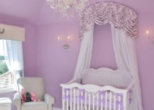
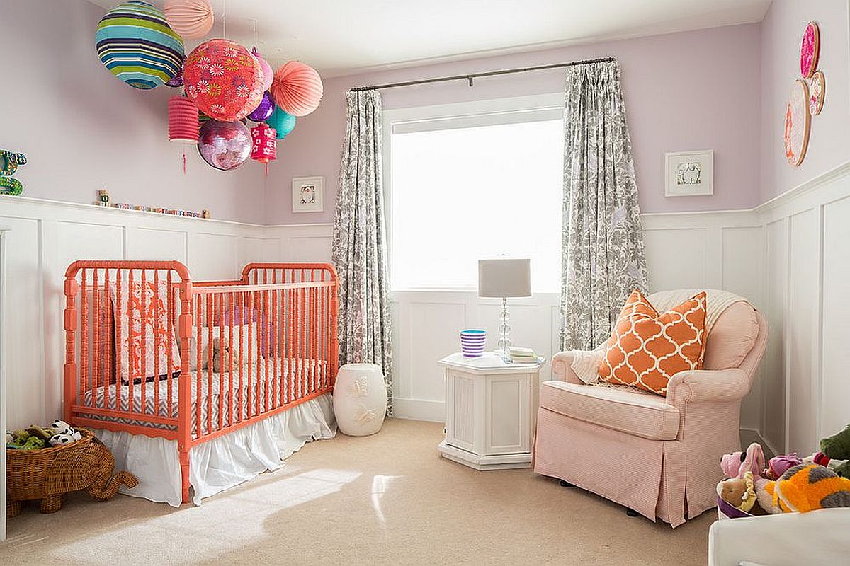
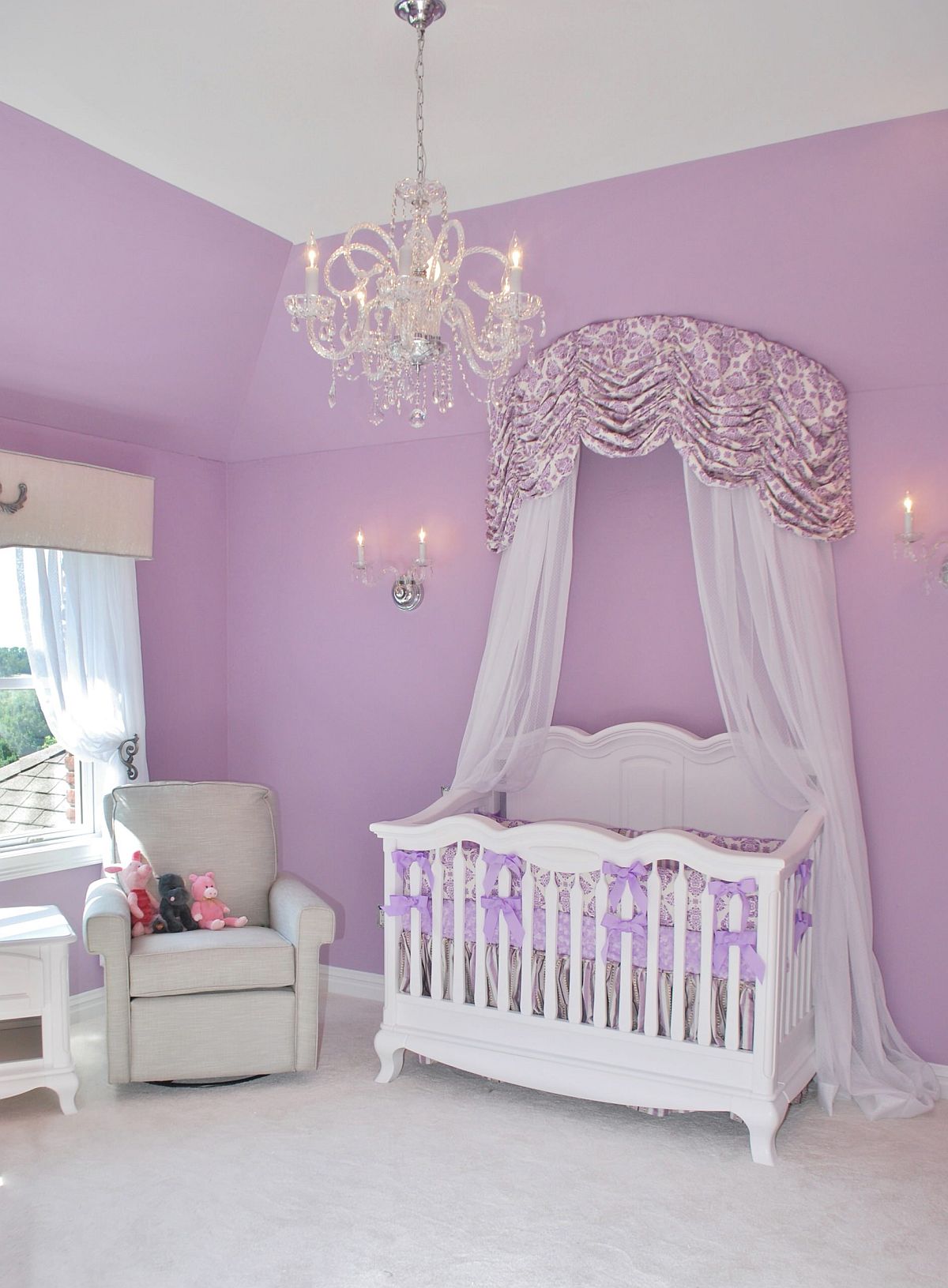
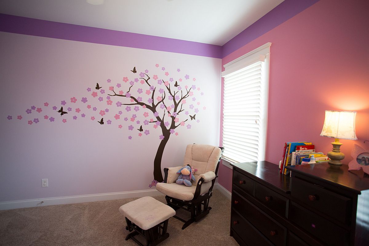
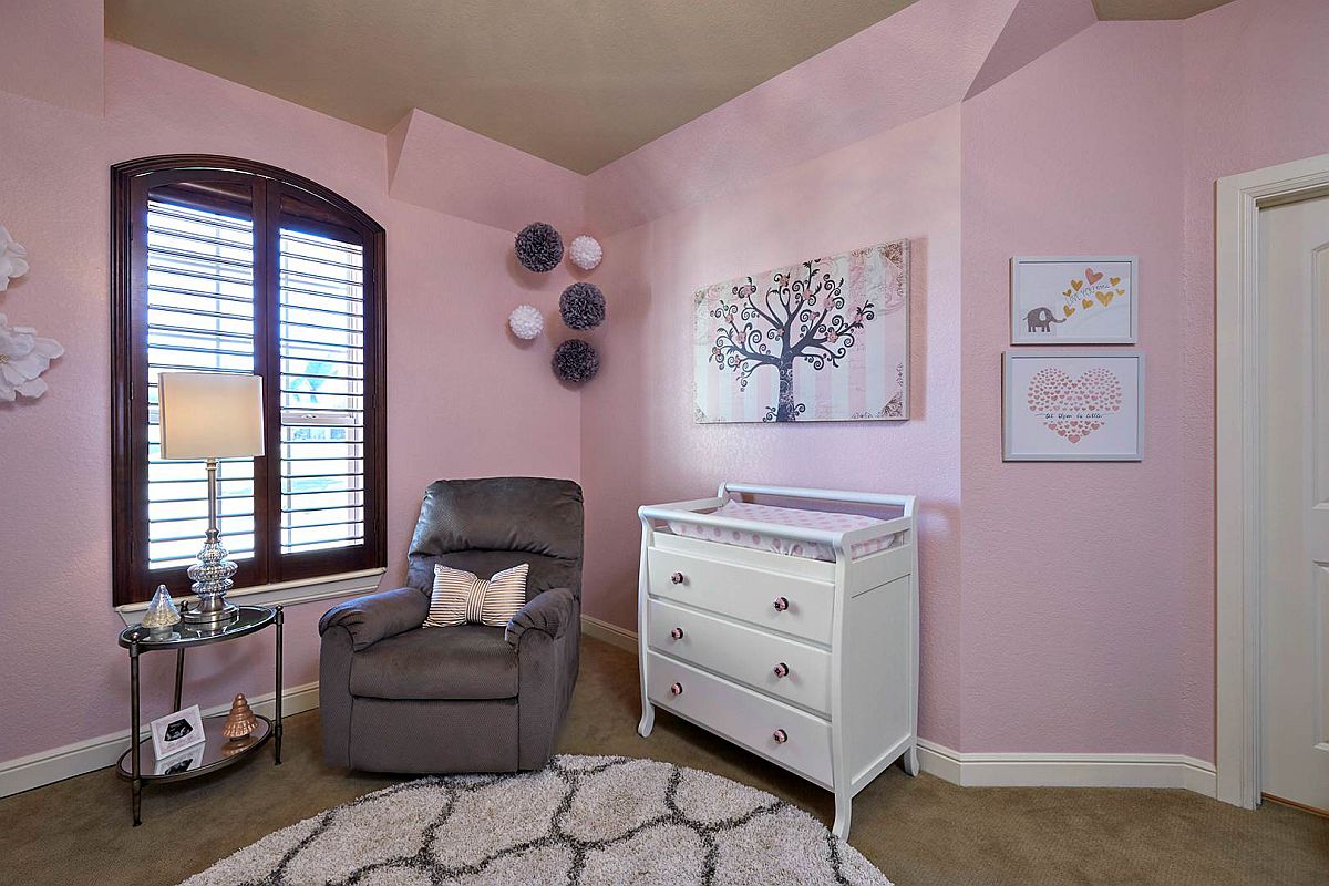
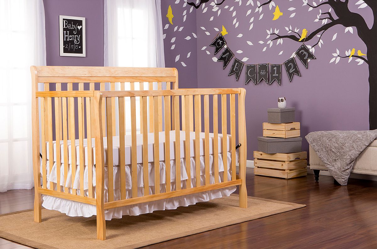
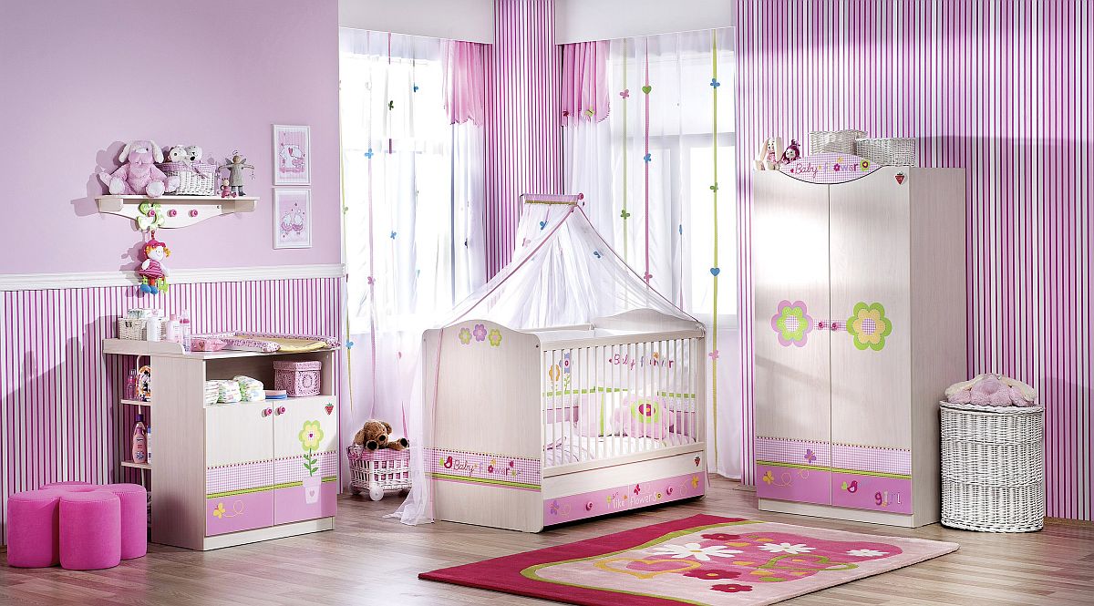
Violets take Bloom!
You might feel that violet nurseries do not fully capture the beauty of fall at its eye-catching best, but it is still a color that is incredibly popular this time of the year. Violet nurseries are just perfect for your little princess and offer an escape from the mundane shades of pink that seem to be used pretty much in every girls’ nursery. Sophisticated and stylish, the color instantly grabs your attention and can be used both to create magical backdrops and also fascinating accents in the modern nursery.
You’re reading Fill the Nursery with Fall Brilliance: Trendy Colors that make a Difference, originally posted on Decoist. If you enjoyed this post, be sure to follow Decoist on Twitter, Facebook and Pinterest.


