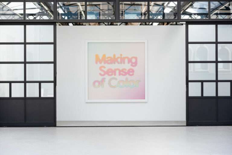
“Just as the history of the world is filled with misery and suffering and war and disease, the history of printing and book design is mostly filled with garbage,” says Michael Russem, book designer and Visiting Curator of Graphic Design at the Katherine Small Gallery, near Boston, which is currently showcasing the iconic work of designer Janet Halverson. This is, in fact, a defense of modern book design: “When we look at the books about the history of printing and typography, we’re only getting the greatest hits and that tends to give the idea that things were better back then. But things weren’t any better: There’s always been terrible design, with a few highlights. So what’s wrong with printing and design now? What’s wrong with the world? We don’t know our history. We’re selfish and we’re show offs. These are things we can see in all sorts of design, not just book design. How do we fix it? I don’t know. Therapy.”
The Janet Halverson show is subtitled “An Introduction,” which is purposeful: Though the now 97-year-old designer created paradigm-shifting covers for some of the best known writers of the second half of the 20th century, she has not, Russem says, earned the public recognition she deserves. “She worked on all sorts of remarkable covers that will be known to people, but her name is known to almost no one,” he says. “She would work on all sorts of books for Jack Kerouac, and John McPhee, and Maya Angelou – so she was trusted and respected enough to get all these really big, important books, but she was not respected enough to be given any attention. Meanwhile, all of her male counterparts, who were working on books just as important, were getting all sorts of attention, but she wasn’t.” The current show, on view until mid-January, features forty of her “one or two thousand books.” “It doesn’t tell her [whole] story,” Russem says, “but I try to point out some of her tricks and her tendencies.”

Practice sheet by sign painter Kenji Nakama, 2023
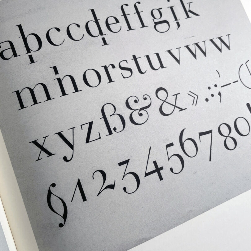
Lettering by F.H. Ernst Schneidler.
Also in this Milkshake, Russem shares his favorite of Halverson’s covers – including a truly weird one for Jeffrey Frank’s The Creep – as well as the work of Eric Carle, who both wrote and illustrated The Very Hungry Caterpillar. He also shares some samples of Dick Bruna, who created Miffy, credited as the inspiration for Hello Kitty. If you love book design, this is one you won’t want to miss. For more, tune in!
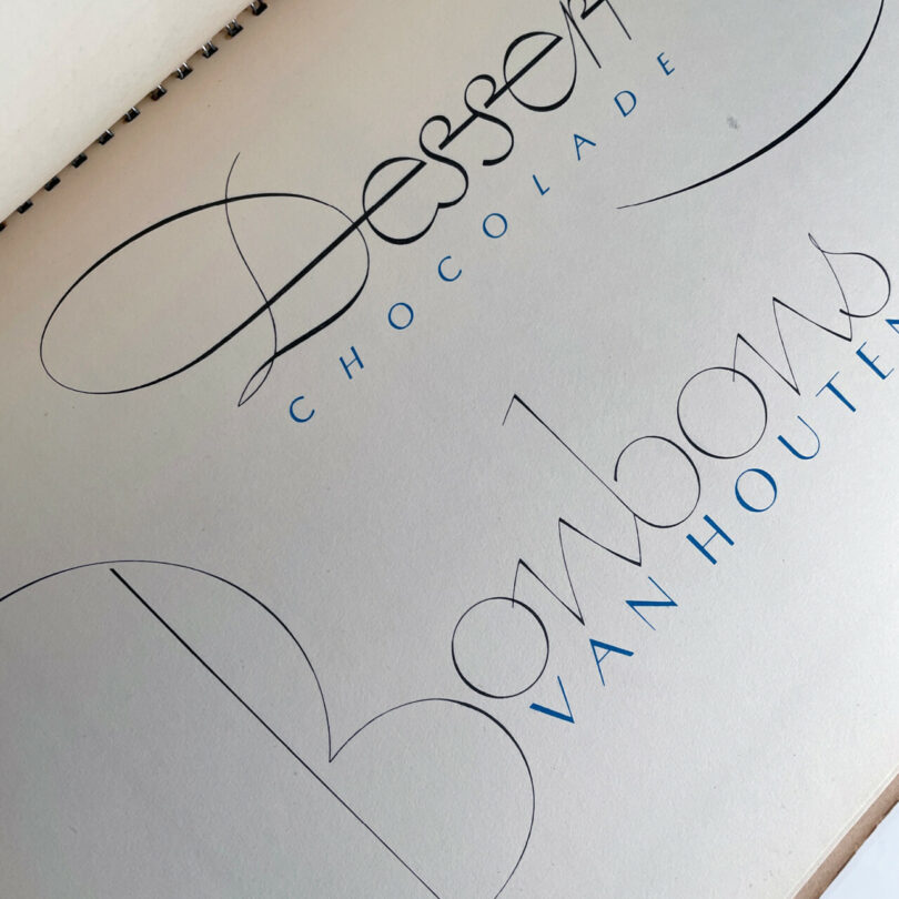
Lettering by Stefan Schlesinger, 1939

Experiments with Letterform and Calligraphy (1997) by André Gürtler
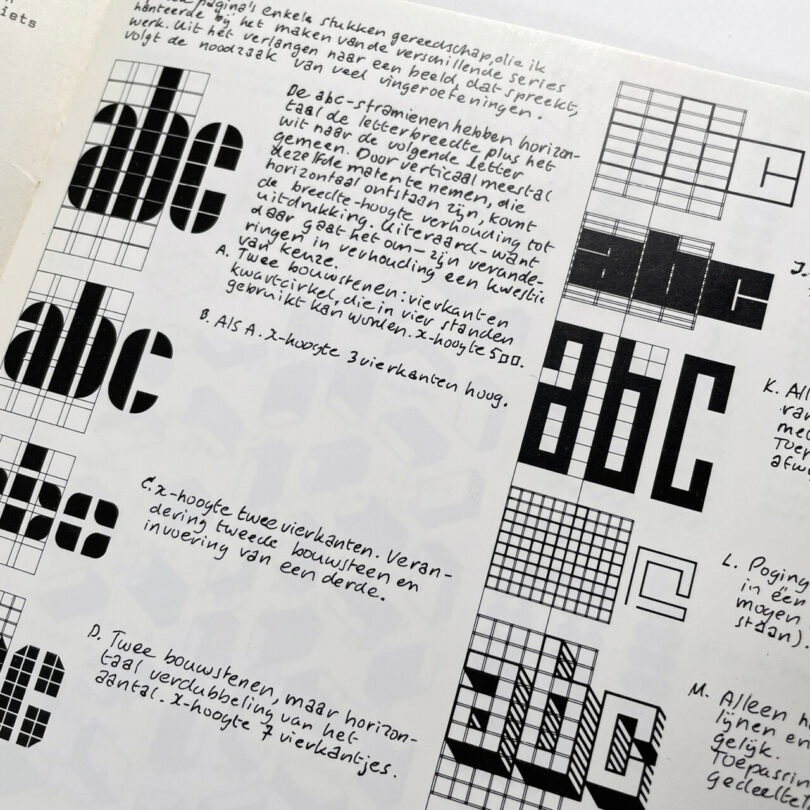
Jurriaan Schrofer’s 1974 plan for a series of modular alphabets

From Fifteen Rejected Designs for a Tote Bag (Design Brief No. 6), 2021
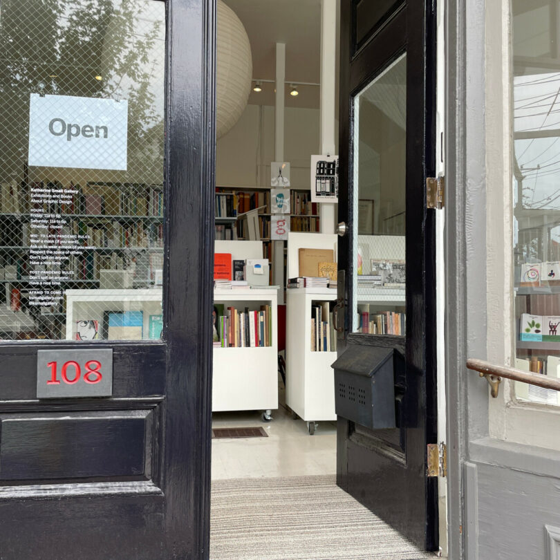
Katherine Small Gallery: The front door

Inside the shop in the fall of 2022
Diana Ostrom, who has written for Wallpaper, Interior Design, ID, The Wall Street Journal, and other outlets, is also the author of Faraway Places, a newsletter about travel.
Milkshake, DMTV (Design Milk TV)’s first regular series, shakes up the traditional interview format by asking designers, creatives, educators and industry professionals to select interview questions at random from their favorite bowl or vessel. During their candid discussions, you’ll not only gain a peek into their personal homeware collections, but also valuable insights into their work, life and passions.

